Topic: Build helper - icons
Venatrix
Joined: 2010-10-05, 19:31
Posts: 449  Tribe Member Location: Germany |
Posted at: 2011-02-16, 22:19
Could you please provide a screen shot for further discussions? Not everybody in the forum has access to Launchpad or several bzr branches. Two is the oddest prime.  Top
Top
 Quote
Quote
|
|
fraang Topic Opener
Joined: 2010-02-15, 12:13
Posts: 239  Widelands-Forum-Junkie |
Posted at: 2011-02-16, 22:58
The problem is I have had no luck to get it ingame.
Top
Quote
|
chuckw
Joined: 2010-03-15, 15:23
Posts: 945  One Elder of Players Location: New York - USA |
Posted at: 2011-02-16, 22:58
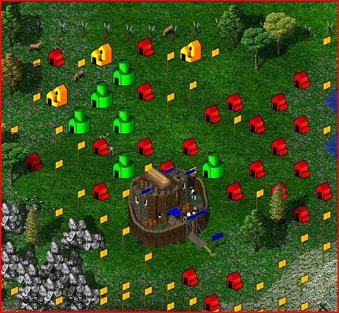
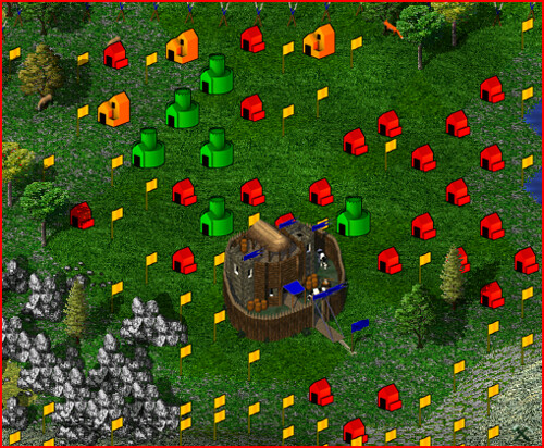
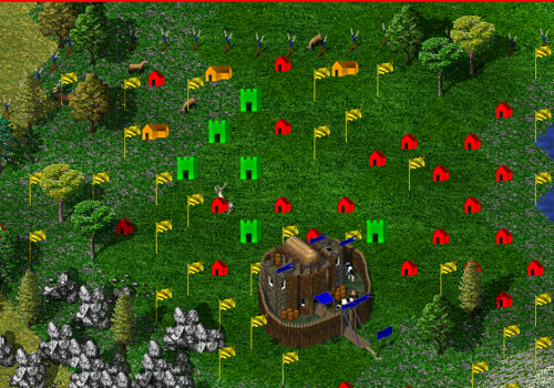
Got you covered. Here are shots of fraang's originals (5), muteds (6) and the current build help icons for comparison: ..... Let's hear your comments! Edit: realigned the graphics Edited: 2011-02-16, 23:12
I see little people.
Top
Quote
|
|
Venatrix
Joined: 2010-10-05, 19:31
Posts: 449 Tribe Member Location: Germany |
Posted at: 2011-02-17, 06:15
Thanks, Chuck. Yes, I vote for 6. The colours are more as the originals ans not that distracting. Edited: 2011-02-17, 06:15
Two is the oddest prime.
Top
Quote
|
Nasenbaer
Joined: 2009-02-21, 17:17
Posts: 828 One Elder of Players Location: Germany |
Posted at: 2011-02-17, 06:44
Jepp that's it :)! Very good work fraang!
Top
Quote
|
|
k54e56
Joined: 2011-01-24, 16:20
Posts: 14  Pry about Widelands Location: Capital of Austria |
Posted at: 2011-02-17, 07:10
don't know whether non-active-developers get a vote here .... is it just me liking the old set better? if you go for the new set, please make it muted (ex 6); and could you turn the icons a little counter-clockwise? [and while i'm at it: could you make the icons appear and disappear when moving the mouse over the screen (so you do not have to turn buildhelp on and off all the time) - i guess that's a major task, but one can always hope] best, k
Top
Quote
|
|
martin
Joined: 2011-01-13, 13:21
Posts: 65  Likes to be here |
Posted at: 2011-02-17, 09:08
Oh yes! 6 is my overall favourite :) In my opinion, they fit a lot better into the game. Thanks to fraang and chuckw! @k54e56 - do you mean that feature from settlers ii, where some small build helper icons appeared, even when the build help was turned off? I guess, that's more a task for the coders rather than the graphic developers. However, I don't really miss that feature. I mostly use the complete build help as it gives a good overview. And just pressing space to turn in on/off doesn't take too long...
Top
Quote
|
|
Tino
Joined: 2009-02-20, 16:05
Posts: 252 Tribe Member Location: Somewhere in Germany... |
Posted at: 2011-02-17, 09:09
My vote goes to 6), too. Great work, fraang! Only 4 pictures, but WL seems to get 4 years younger
Top
Quote
|
|
Venatrix
Joined: 2010-10-05, 19:31
Posts: 449 Tribe Member Location: Germany |
Posted at: 2011-02-17, 09:25
Why not? Everybody shall enjoy the game. And different features or graphics can help a lot. What do you think, why theres an forum for discussions? ;-) By the way: Im no developer. About the mouse moving: I have to agree with martin. It definitely is a coding task and something that is imo not really necessary. Two is the oddest prime.
Top
Quote
|
|
SirVer
Joined: 2009-02-19, 14:18
Posts: 1445 One Elder of Players Location: Germany - Munich |
Posted at: 2011-02-17, 09:32
What makes a developer? And how to distinguish it from a Non Developer? Imho, in a community project, the community is the developer. I prefer 5 because I like pop-colored graphics, but I like 6 also. I am very glad that the perspective build icons will vanish... They somehow disturbed my spacial sense. Excellent work!
Top
Quote
|
 Can anyone else do it?