


Topic: Build helper - icons
Venatrix
Joined:
2010-10-05, 20:31 UTC+2.0
Posts: 447  Tribe Member Location: Germany |
Posted at:
2011-02-14, 22:36 UTC+1.0
I have some problems with the colour. Or better, with the brightness. Especially the middle and big buildings are brighter than the originals. I think that this is more distracting (what we dont want). And it hurts my eyes a bit (could be a problem with the monitor I use at the moment, though). Could you darken it a bit, please? Two is the oddest prime.  Top
Top
 Quote
Quote
|
|
Gannaf
Joined:
2010-06-22, 00:10 UTC+2.0
Posts: 47  Pry about Widelands Location: Germany, Bird Mountain |
Posted at:
2011-02-14, 23:30 UTC+1.0
Beautiful!
4) fits best all together in my opinion, especially the size. This plus slightly darkened colour as venatrix said, and its perfect for me
Top
Quote
|
|
Tino
Joined:
2009-02-20, 17:05 UTC+1.0
Posts: 251 Tribe Member Location: Somewhere in Germany... |
Posted at:
2011-02-15, 09:03 UTC+1.0
Those icons are just great! In my opinion you don't need to darken them, is icons they should be bright to are in contrast to all other items on the screen in all landscapes. My vote goes to screenshot 3/4. I like the new flag, but it seems it is missing the perspective of the other icons. The same applied should make them appear a bit smaller an more consistent.
Top
Quote
|
|
SirVer
Joined:
2009-02-19, 15:18 UTC+1.0
Posts: 1440  One Elder of Players Location: Germany - Munich |
Posted at:
2011-02-15, 09:55 UTC+1.0
I like 1, though the hotspot of the flag symbol is off. I actually think the big houses look kinda cool... though they might be too distracting in the game (have no time to play for a looong while now I think the old flag (with the shading) does not go too well with the new house icons.
Top
Quote
|
|
kingcreole
Joined:
2010-12-18, 12:13 UTC+1.0
Posts: 93  Likes to be here Location: germany |
Posted at:
2011-02-15, 15:25 UTC+1.0
i thought 4 might be a nice idea because of the flags but then... i agree, those bigger buildings look so much better. widelands biggest problem seems to me to be the need to zoom in to see the detail. i guess with zoom enabled it might get better but untill then, please use the big buildings!! the small ones are far too small! live is my dancefloor as long as my lag works
Top
Quote
|
chuckw
Joined:
2010-03-15, 16:23 UTC+1.0
Posts: 945 One Elder of Players Location: New York - USA |
Posted at:
2011-02-15, 15:40 UTC+1.0
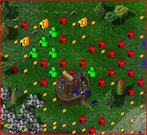
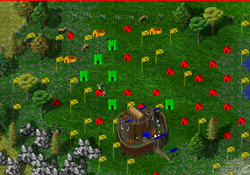
Okay, fraang provided a slightly smaller "big" symbol and altered the set_flag. (I cropped his new flag symbol so it would position properly on the hot spot.) Here is a sample with a shot of the originals for comparison: 5) fraang's adjusted Other shots can be found in the earlier post-4300 Personally, the larger (than originals) symbols are starting to "grow" on me. (Pun intended.)
Edited:
2011-02-15, 15:48 UTC+1.0
I see little people.
Top
Quote
|
|
martin
Joined:
2011-01-13, 14:21 UTC+1.0
Posts: 65 Likes to be here |
Posted at:
2011-02-15, 16:18 UTC+1.0
I agree with Venatrix - I would like to see them a little bit darker, especially the green and the yellow one.
But all in all, your icons really look good in the game
Top
Quote
|
Nasenbaer
Joined:
2009-02-21, 18:17 UTC+1.0
Posts: 826 One Elder of Players Location: Germany |
Posted at:
2011-02-15, 18:32 UTC+1.0
Wow cool :)
I like (5) very much! Very good work. For me the colors are alright, but well let's test, how the icons would look like if they were darker
Top
Quote
|
|
SirVer
Joined:
2009-02-19, 15:18 UTC+1.0
Posts: 1440 One Elder of Players Location: Germany - Munich |
Posted at:
2011-02-16, 13:52 UTC+1.0
I love 5! I'd like to see a comparision with darker icons as well, but I think 5 will be my favorite.
Top
Quote
|
|
fraang Topic Opener
Joined:
2010-02-15, 13:13 UTC+1.0
Posts: 239  Widelands-Forum-Junkie |
Posted at:
2011-02-16, 21:59 UTC+1.0
I have updated the branch again. I have made them darker. You can find it in the "final" directory. The "wip" directory contains all the development files.
Top
Quote
|

 ).
).
 I rather like #5 as a potential new set of symbols for the game. I think fraang's choice of color and shading in this set is perfectly acceptable.