
Topic: Tribal Resource Signs
|
QCS
Joined:
2009-12-29, 22:47 UTC+1.0
Posts: 256  Tribe Member |
Posted at:
2012-05-02, 18:45 UTC+2.0
The droplet is a great idea. Much better than the blue blob From the 'other' signs, I like the sand piles with the ore samples most... I'm only thinking how it might look like to have 20 sandpiles on the mountain. Well, I guess it clearly shows there has been some digging... So my vote is clear - the sandpiles with samples, and the droplet for water. CMake is evil.  Top
Top
 Quote
Quote
|
Venatrix
Joined:
2010-10-05, 20:31 UTC+2.0
Posts: 447 Tribe Member Location: Germany |
Posted at:
2012-05-02, 19:43 UTC+2.0
Hmm Personally I prefer the signs. The version is not important for me (only B for Empire). But can you provide the pictures on different mountain terrains? Theres more than one, right? And the water sign is needed to be shown on grass. I think its hard to decide without all the informations. Two is the oddest prime.
Top
Quote
|
|
fuchur
Joined:
2009-10-07, 14:01 UTC+2.0
Posts: 189  Widelands-Forum-Junkie Location: Germany |
Posted at:
2012-05-02, 23:29 UTC+2.0
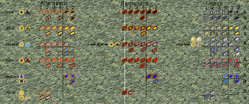
Thank you, Chuck, for the overwiew. When I look at them I prefer the signs. Maybe it's just that I'm more used to them, but I like them more as the piles. And I think especially gold and iron ore are better recognizable even at a short glance. For a small amount I vote for 2, the vertical bar. For a large amount I also prefer 2, and for the empire version B. The darker background increases the visibility of the small amount sign. To indicate no ressources both the white cross and the empty sign are fine.
Top
Quote
|
chuckw
Topic Opener
Joined:
2010-03-15, 16:23 UTC+1.0
Posts: 945  One Elder of Players Location: New York - USA |
Posted at:
2012-05-03, 00:49 UTC+2.0
Thanks for your comments. Per Venatrix's request, here are the resource markers with various terrain backgrounds: and here are the water-bearing terrain As much as I like the sample piles, I have to admit that the signs do stand out more consistently. I think their regular rectangular shape with defined edges makes them easier to distinguish. Let me hear your thoughts and post a vote for your favorite. I see little people.
Top
Quote
|
|
Venatrix
Joined:
2010-10-05, 20:31 UTC+2.0
Posts: 447 Tribe Member Location: Germany |
Posted at:
2012-05-03, 09:03 UTC+2.0
Yes, still vote for the signs. I just have a little trouble to recognise the Atlantean signs on the yellowish mountain terrains (the second and the fifth). IMO they dont distinguish enough from the background. Especially the None sign with cross is hard to be seen on the fifth terrain. Two is the oddest prime.
Top
Quote
|
Nasenbaer
Joined:
2009-02-21, 18:17 UTC+1.0
Posts: 826 One Elder of Players Location: Germany |
Posted at:
2012-05-03, 13:24 UTC+2.0
The pile animation sounds like a nice idea, but I still prefare the old fashioned signs
The general color of the signs for each tribe looks good.
The water color looks too dark for the imperial and barbarian signs, while the light blue for granite/marble seems to be missleading
Adding geometrical signs as replacement of big and small spots seems a bit unintuitive to me... I did not get what they want to tell me until I read the explanation. So:
Just my 2cents Thanks Chuck for your work on all these examples, it makes the decission even harder, as there are many good ideas. But that's the way it should be in a creative phase :), shouldn't it?
Top
Quote
|
|
wl-zocker
Joined:
2011-12-30, 17:37 UTC+1.0
Posts: 492 Tribe Member Location: Germany |
Posted at:
2012-05-03, 18:32 UTC+2.0
After having seen the signs in direct comparison to the piles, I definitely prefer the signs. As Venatrix already said, the Atlantean signs are bad to recognize especially on the fifth mountain terrain. As the signs look good, what about changing the color of the mountain? (just an idea, what do others think?) I prefer the signs number 2 (of both the small and the big amount) and the B version of the Empire's signs and the Atlantean crystal signs. For the "none" sign, I prefer the version with the cross. I like the color of the different ressources as they are and I see no need to change them. "Only few people know how much one has to know in order to know how little one knows." - Werner Heisenberg
Top
Quote
|
|
chuckw
Topic Opener
Joined:
2010-03-15, 16:23 UTC+1.0
Posts: 945 One Elder of Players Location: New York - USA |
Posted at:
2012-05-03, 19:35 UTC+2.0
Here is another summary (I know it is getting confusing) incorporating some of Nasenbaer's ideas, i.e. lighter water color and marble, along with an empty rectangle to signify small amounts. @wl-zocker: Mountains I will save for another time and another place after I get these markers put to bed (if ever). >:-) What I am hearing from the majority seems to be:
Have we whittled this down to just the bar or rectangle for small amounts? (My old eyes think the dot is too small to be readily visible in some cases.) I await your pleasure. I see little people.
Top
Quote
|
|
chuckw
Topic Opener
Joined:
2010-03-15, 16:23 UTC+1.0
Posts: 945 One Elder of Players Location: New York - USA |
Posted at:
2012-05-03, 19:50 UTC+2.0
I just realized the barbarian stone should be whiter not darker as I have depicted it. So picture that option as more like the white empire marble. Like this: Speaking of marbles, has anyone seen mine? I seem to have lost them among these signs.
Edited:
2012-05-03, 20:06 UTC+2.0
I see little people.
Top
Quote
|
|
Venatrix
Joined:
2010-10-05, 20:31 UTC+2.0
Posts: 447 Tribe Member Location: Germany |
Posted at:
2012-05-03, 20:35 UTC+2.0
It definitely sets them more apart from the yellowish mountain terrains. But it seems a bit strange as the other tribes dont use such a border (one could argue with the different cultures though). Can you perhaps try to use the texture from the Atlantean buildings? I dont know, if that would make visibility better or worse, but maybe its worth a try?
Vote for #2. The rectangle especially of the brighter colours are not easy to distinguish at the Atlanteans signs. Must be the tribe, I think.
Most people voted for B, the darker background, as I see it.
Hmm I think that can be very confusing, especially for new players, when light blue at the two first tribes (according to the tutorial scenarios) means water and the next tribe uses the same (or nearly the same) colour for a completely different resource. Thats more important as the stone colours from the other tribes are similar to each other.
I read sign with cross one time more often than blank sign. Two is the oddest prime.
Top
Quote
|
 And I agree to the reasoning about the buckets.