Topic: Player Color Adjustment
Nasenbaer
Joined: 2009-02-21, 17:17
Posts: 828  One Elder of Players Location: Germany |
Posted at: 2012-05-11, 17:19
is it my screen or are it my eyes? :-D I actually never understood where the problem with the color persists and the picture with changed color shows me one more time, that the original blue colors are just perfect (for me) - I find the lighter color not as good visible as the original darker one. So from me a clear "keep as it is" ... but as I asked at the beginning... maybe my screen colors are somehow false or maybe it's just me  Top
Top
 Quote
Quote
|
chuckw
Topic Opener
Joined: 2010-03-15, 15:23
Posts: 945 One Elder of Players Location: New York - USA |
Posted at: 2012-05-11, 17:37
Or maybe your screen colors are superior to many others. Depending on the technologies, age, manufacturer, individual settings, etc. many displays can vary considerably from the "true color". I confess that I have never calibrated my LCD monitor and laptop displays and my perceptions are likely a tad "off" to begin with. So I'll register your vote as +1 for no change and wait to see how others respond. Thanks for your input! I see little people.
Top
Quote
|
|
chuckw
Topic Opener
Joined: 2010-03-15, 15:23
Posts: 945 One Elder of Players Location: New York - USA |
Posted at: 2012-05-11, 18:04
I would also add that there are differences in color interpretation between different software packages and graphics handlers. Just one more consideration. I see little people.
Top
Quote
|
Venatrix
Joined: 2010-10-05, 19:31
Posts: 449  Tribe Member Location: Germany |
Posted at: 2012-05-11, 19:23
I just had a look ingame and must agree to Nasenbaer. The blue is nearly invisible in front of water and not clear enough in front of grass. So I vote for the old colour, too. Two is the oddest prime.
Top
Quote
|
|
chuckw
Topic Opener
Joined: 2010-03-15, 15:23
Posts: 945 One Elder of Players Location: New York - USA |
Posted at: 2012-05-12, 00:06
Of course we don't have only two shades of blue to consider in this exercise. There are literally thousands from which to choose. Perhaps something middle ground between our current and proposed hues? Here is the image I showed earlier: Tell me if you wish to see any other samples. Meanwhile, I may tinker with it a little. BTW - my "purple problem" appears to be something in my Firefox installation. My Chrome (Chromium) browser presents the colors closer to what I see in the game. I see little people.
Top
Quote
|
|
chuckw
Topic Opener
Joined: 2010-03-15, 15:23
Posts: 945 One Elder of Players Location: New York - USA |
Posted at: 2013-04-24, 21:51
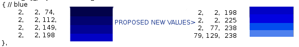
After finalizing (kinda) the blue player color, I've looked at the others and would like to suggest some changes to a couple of them. 1) Is it just my eyes or does the green player color seem too bright, like a neon green? I'm reminded of road workers in their day-glo high visibility vests and such. I'd like to tone the current green down a bit. 2) And I don't no about anyone else, but I have to double check to distinguish between the yellow and orange colors, especially in the mini-map. I'd like to darken the orange. Heck, while we are at it, 3) why not bring the red down a touch, too, to further distinguish it from orange? 4) Lastly, the current purple looks deep pink to me. Not that that isn't a nice color, but it's not purple to my eyes. So here is what I am proposing (The numbers are the RGB values which you could plug into ~src/logic/player.cc for a build to test them in the game.) :
What do you think? I see little people.
Top
Quote
|
|
ixprefect
Joined: 2009-02-27, 13:28
Posts: 367 Tribe Member |
Posted at: 2013-04-29, 19:46
The orange improvement looks good. For the other, I guess I'd like to try them out in the game first before forming my opinion.
Top
Quote
|
|
Adamant
Joined: 2012-10-11, 15:21
Posts: 180  Widelands-Forum-Junkie Location: Alemania |
Posted at: 2013-04-30, 15:05
For my Eyes the Colors of Orange red and Yellow are somewhat "close" for my ColorRules. Most Sensitivity for Red and Green resp inverse a stronger Reduction of Color-Value. I vote for your improved Colors (I did already wonder about magenta) but wonder why Cyan is not there and would drop Orange in Favor for Cyan. I don't know eg. why Colors like Blue got some Points on RG while 20% of Blue misses. May be due to I would had selected RGB-Values directly. Aside of "minor Differences" the Colors above match IMO well to that below: RED 255,000,000 GREEN 000,255,000 BLUE 000,000,255 CYAN 000,255,255 MAGENTA 255,000,255 YELLOW 255,255,000 WHIE 255,255,255 BLACK 000,000,000 I don't know if the Colors above factored in other Matters like Colors of Terrain on MiniMap but clearly understandable by RGB-Codes these Colors here are most distant allowing best Distinguishment. Orange with 255,128,000 is in the Middle of 255,000,000 and 255,255,000 and thus harder to distinguish. Additionally I would add for Player-Colors some Flicker (Term?) making these Dots to identify: Assume there is a static Terrain-ColorCode more or less similar to Player-ColorCodes, eg any Terrain-Red and a Player-Red. To distinguish them better any additional Signature have to get added to the Dot: if we consider the Player to be more active than the Terrain (and lesser often present on the Map) than the Player-Red could change between 255,0,0 and 128,0,0 (staying Red but different bright). My biggest Problem with present MiniMap-Colors is that active Things are hard to distinguish from inactive. More critical than EnemyWorkers are EnemySoldiers. I don't remind whick Colors made me Problems but any DID for sure - I forgot which - so your Colors are IMO relevant. Ivan the Terrible is dead .. Genghis Khan is dead .. and I do not feel well, too.
Top
Quote
|

 However, I don't think I'm the only one in that situation. We all must use the equipment that we have available to us (flawed as it may be).