Topic: subopimal readability of wares production statistics
Astuur
Topic Opener
Joined: 2009-02-28, 09:08
Posts: 733  One Elder of Players Location: Frankfurt / Germany |
Posted at: 2011-02-24, 12:55
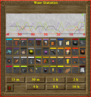
I have experimented with drawing a new background bitmap, but could not come up with anything that would give good contrast with all the wares graphs colors -- and I cannot change them. Still there are some easy changes that could be helpful for this. 1) change the stonelike background to a uniform color; it's nice, but not helpful Maybe someone can tackle this? Being no programmer, I apologize for all my suggestions that imply undue workload and for other misjudgements due to lack of expertise or relevant skills.  Top
Top
 Quote
Quote
|
chuckw
Joined: 2010-03-15, 15:23
Posts: 945 One Elder of Players Location: New York - USA |
Posted at: 2011-02-24, 16:42
To assist this discussion, I include a screenshot of the window in question: I see little people.
Top
Quote
|
|
Astuur
Topic Opener
Joined: 2009-02-28, 09:08
Posts: 733 One Elder of Players Location: Frankfurt / Germany |
Posted at: 2011-02-24, 17:23
Great-- thanks Chuck! Especially the green nnumber in the upper right corner is almost impossible to read (at least for me). Being no programmer, I apologize for all my suggestions that imply undue workload and for other misjudgements due to lack of expertise or relevant skills.
Top
Quote
|
|
raymond
Joined: 2011-04-24, 17:36
Posts: 36  Pry about Widelands Location: Mainz / Germany |
Posted at: 2011-04-25, 21:55
The stonelike background is okay, much better than simply white. Better use black or red (like the x-axis) font color for the numeric value in the right upper corner. Edited: 2011-04-25, 21:55
Top
Quote
|
Venatrix
Joined: 2010-10-05, 19:31
Posts: 449  Tribe Member Location: Germany |
Posted at: 2011-04-26, 18:23
Because ixprefect asked in the German forum for it: I searched in Launchpad for a bug report concerning this topic and tadaa found an old one: https://bugs.launchpad.net/widelands/+bug/536589 Two is the oddest prime.
Top
Quote
|