Topic: multiplayer ui fine tuning
stonerl
Topic Opener
Joined: 2018-07-29, 23:03
Posts: 327  Tribe Member |
Posted at: 2018-08-19, 23:31
During the last week I did some fine tuning to the multiplayer ui. I'm going to use two resolutions to show you the difference: 800X600 and 1200x800 (that's the highest I can test). Currently there is lots of empty spaces. E.g between the players and the chat, or the margin to the left and right is to little. So here is a little comparison. The first is the current design and the second the new. 800x600:
1200x800:
I also figured out that the warning message I was talking about in another thread will only show up on the client side and will never interfere with the "Suggested Team"-Box. So I took the liberty and gave it more space:
The Code can be found on Launchpad. I'd be nice if some of you could test it with different resolutions and give me some feedback. Edited: 2018-08-19, 23:32
 Top
Top
 Quote
Quote
|
GunChleoc
Joined: 2013-10-07, 14:56
Posts: 3324  One Elder of Players Location: RenderedRect |
Posted at: 2018-08-20, 08:55
I think the screenshots look good - definitely an improvement. The road map that I have in my head for this is:
Busy indexing nil values
Top
Quote
|
kaputtnik
Joined: 2013-02-18, 19:48
Posts: 2439 OS: Archlinux Version: current master One Elder of Players Location: Germany |
Posted at: 2018-08-20, 10:34
In the "Game setup menu" we could maybe join the 'Map' button and the maps name into one single button. Fight simulator for Widelands:
Top
Quote
|
|
stonerl
Topic Opener
Joined: 2018-07-29, 23:03
Posts: 327 Tribe Member |
Posted at: 2018-08-21, 19:01
Hmm, not sure about this, though. I kinda like the way it looks now, with the pictured button. @Gun what are your thoughts on this.
Top
Quote
|
|
GunChleoc
Joined: 2013-10-07, 14:56
Posts: 3324 One Elder of Players Location: RenderedRect |
Posted at: 2018-08-24, 17:56
I don't really have an opinion on this at this time. It's definitely worth exploring though. Busy indexing nil values
Top
Quote
|
|
stonerl
Topic Opener
Joined: 2018-07-29, 23:03
Posts: 327 Tribe Member |
Posted at: 2018-12-15, 16:39
I usually don't play in singleplayer mode. Even when playing against computers I use multiplayer. What I noticed is that in singleplayer the slots are filled with the tribes according to what the map designer had in mind. In multiplayer the slots are prefilled with the Barbarians, only. Would it somehow make sense to autoselect the tribes as it is done in singleplayer?
Top
Quote
|
WorldSavior
Joined: 2016-10-15, 03:10
Posts: 2094 OS: Linux Version: Recent tournament version One Elder of Players Location: Germany |
Posted at: 2018-12-17, 16:20
I think it would make much more sense if the slots become prefilled with random tribe, no matter if multiplayer or singleplayer. Wanted to save the world, then I got widetracked
Top
Quote
|
|
stonerl
Topic Opener
Joined: 2018-07-29, 23:03
Posts: 327 Tribe Member |
Posted at: 2019-12-08, 21:57
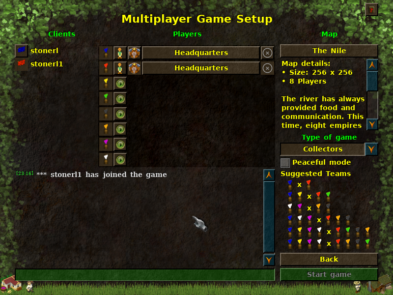
I did some more tweaking. Especially since we got the Peaceful Mode, free space got rare. I moved the "Start game" button to the bottom. Also, the info "You are Player X / Spectator" is removed since it did not provide any additional information. Map name & map/save game button are now merged into a single button.
The Information about the missing map/save game is now in the map description box. Don't get confused about the "Start game" button, as this screenshot is from an older revision.
Top
Quote
|
|
kaputtnik
Joined: 2013-02-18, 19:48
Posts: 2439 OS: Archlinux Version: current master One Elder of Players Location: Germany |
Posted at: 2019-12-09, 07:59
Is it possible to have the 'Back' and the 'Start Game' button always at the same position? In the past sometimes i pushed the 'Back' button accidentally instead of 'Start game'... just because i was used to click on the bottom right button. Fight simulator for Widelands:
Top
Quote
|
|
stonerl
Topic Opener
Joined: 2018-07-29, 23:03
Posts: 327 Tribe Member |
Posted at: 2019-12-09, 08:45
The start and back buttons are always positioned as in picture 1 and 2. The 3rd picture is only there to illustrate the new warning implementation; ignore the buttons. Is that what you mean? Edited: 2019-12-09, 08:47
Top
Quote
|